Color inspires us and evokes emotion, whether joyful or relaxing. And in a sea of grays and neutrals, the right pop of color is like a work of art celebrating bold, elevated design, inside and out.
When considering ways to create signature and colorful design moments for both floors and walls, tile offers varied and vibrant shades. The simplest way to select tile color is to explore color categories, be it greens, blues, reds, or yellows. With so many color variations, there truly is a tile for every color mood and every design project.
Green
As biophilic design continues to play a significant role in our spaces, tiles in striking greens add lush visuals to surfaces, coupled with easy care and maintenance, already inherent in the material.
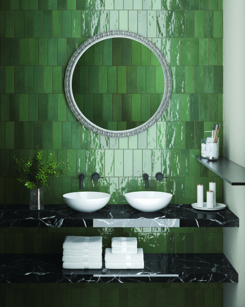
Saturated color draws the eye. And paired with neutral elements like faucets and fixtures, Passion™ (shown here) shines bright. Plus, subway tile will always be a classic.
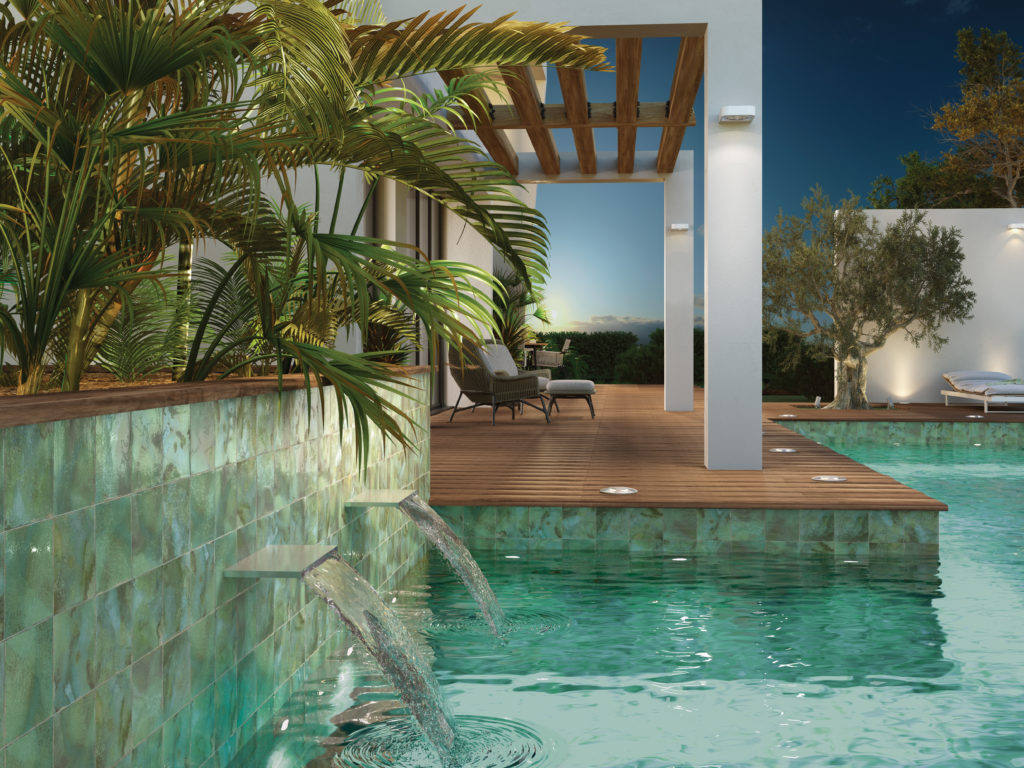
Tiles for outdoor projects continue to gain significance as more individuals look to entertain, relax, and exercise in the open air. A refreshing choice for pools is the green palette featured within the Immerse™ series.
Blue
Blue enjoys the distinction of being the most beloved color worldwide. It’s varied hues embody stability, evoking feelings of serenity often associated when gazing toward the skies or the seas.
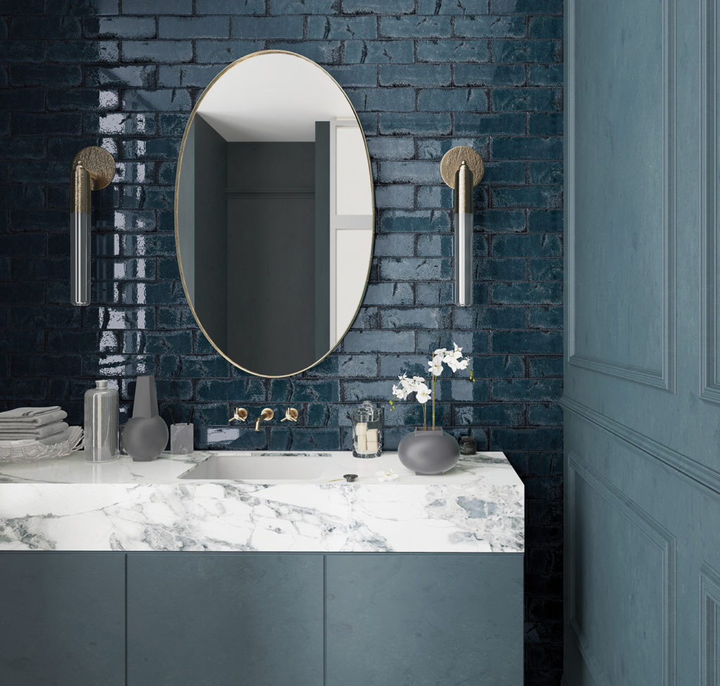
Pops of colors often find their way into powder rooms or guest baths. Here, the glistening effect of Inhale™ enlivens the space.
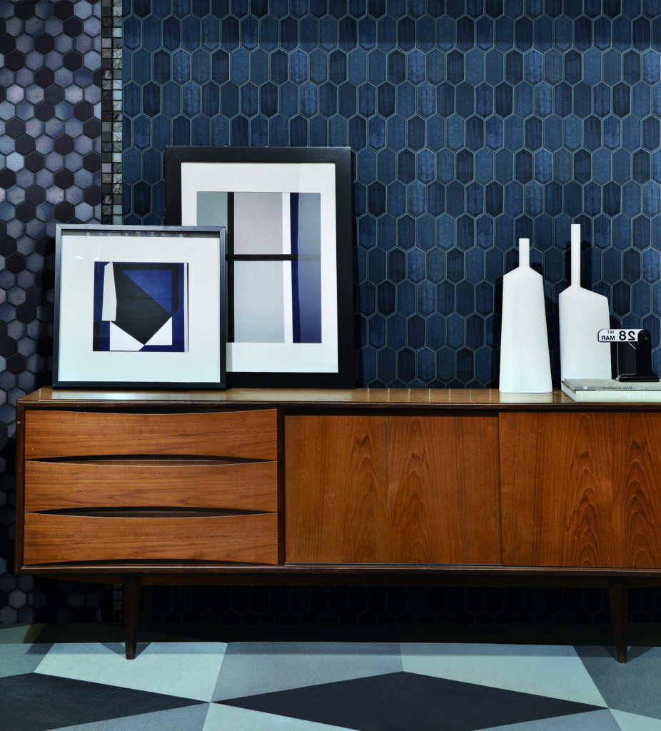
Pairing deep blue and an elegant hexagonal shape with Omni™ creates a backdrop that enhances stylish decorative accessories.
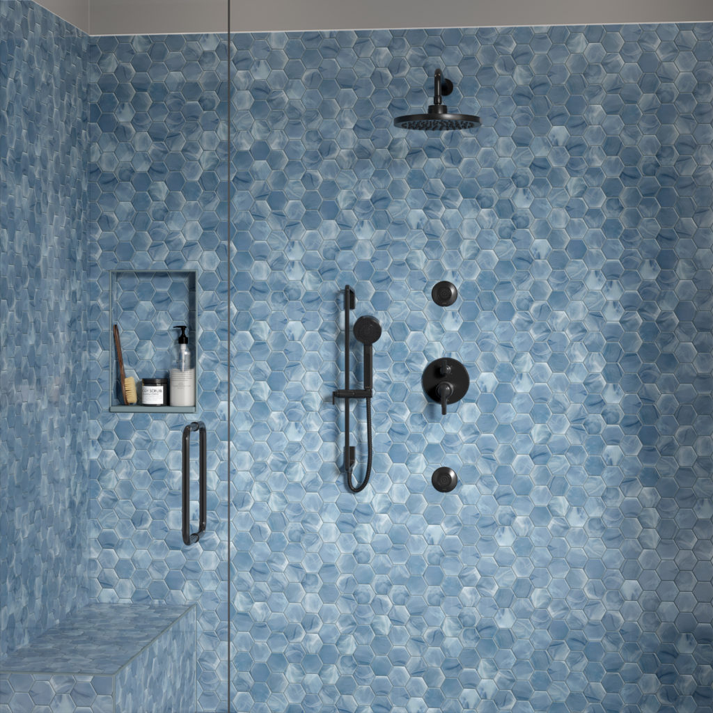
The bath is your personal spa and haven. Whether you start your day here, or end it, a calming blend of blues utilizing Splash™ is inviting.
Red/Rust
While red brings a powerful pop of color, its sister rust offers an earthy alternative with glimpses of red, brown, orange, and even yellow. No matter the design direction taken, the destination delivers warmth every time. And on occasion, a touch of drama!
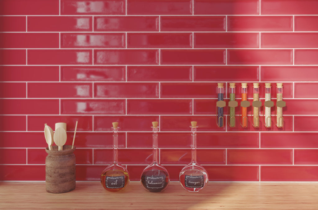
Stimulate the senses with a Raku™ backsplash in the kitchen. Incidentally, rumor has it that red can make you hungry, too.
A chic alternative in the Rust family is award-winning Newtro™ where the pop not only creates its own design moment, but also is a foil to the crisp classic cabinetry.
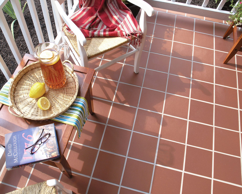
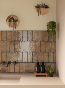
A spicier version of Rust finds its home outside. E-Quarry™ is a contemporary take on the classic and weathered shade of bricks.
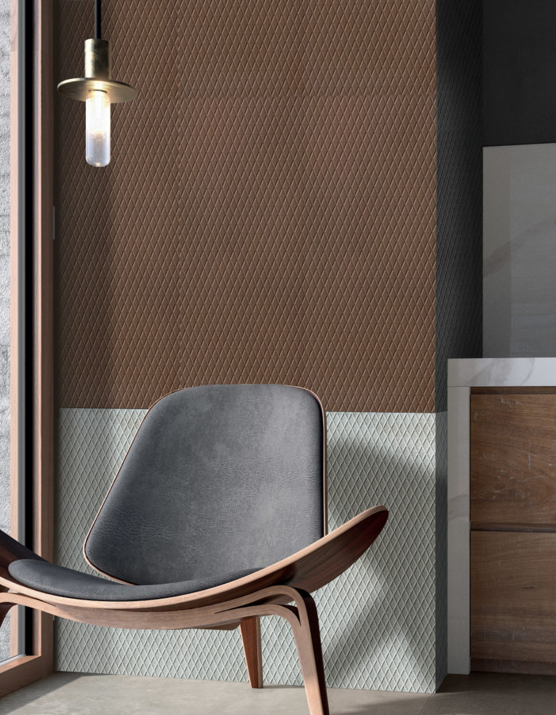
At the other end of the Red and Rust spectrum is a luxurious sable shade featured in the Ironworx™ series. The diamond texture elevates the rich color even further.
Yellow/Cream
No other color broadcasts a sense of warmth, and comfort like yellow. Closely related is a growing desire for creams, too, as an alternative to bright whites. When selecting a hue in this family, consider the undertones of other materials in the space for a harmonious effect.
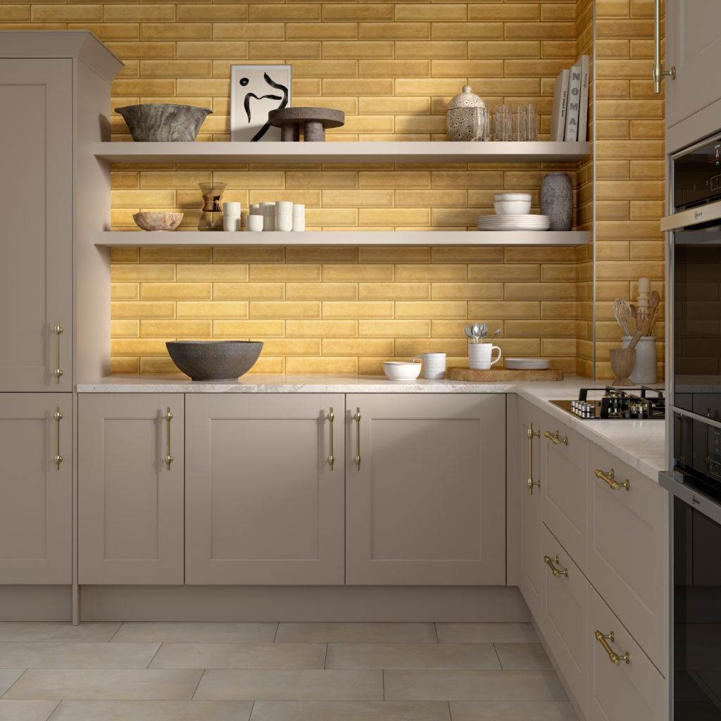
Inspired by the Japanese method for firing pottery, Raku™ comes alive with a seriously saturated Mustard. Let the sunshine in.
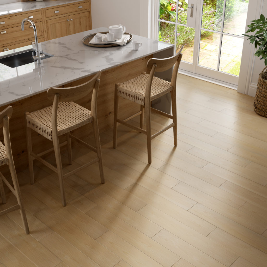
Coveting wood looks in creamy tones is the new norm with Banzai™. Both classic and cozy, the warm textures highlight the tailored side of color pops.
The full spectrum of color plays a role in defining your design point of view. Couple the intrinsic beauty of these new classic pops of color with the inherent benefits of tile for truly compelling projects. Explore more color trends here.

Leave a Reply